
How People Read Your E-Learning
Imagining and text scanning research implications for digital training design

The assumption baked into screen after screen of corporate digital learning is that someone will arrive, settle in, and work through the content carefully from top left to bottom right, absorbing everything that has been written for them. Eye-tracking research has been demonstrating, consistently, since 2006 that this is not how people engage with digital content. They scan. They do it fast, they do it in predictable patterns, and the design decisions we make either work with those patterns or against them.
This is the fifth article in the UX for L&D series, and it is the one most directly focused on digital learning design. The principle applies broadly, as every article in this series has tried to show, but the research here comes from web usability, and the most direct application is to the screens we build in e-learning tools, LMS environments, and digital performance support. If you design content that people engage with on a screen, the findings below are worth taking seriously.
Eye-Tracking Research
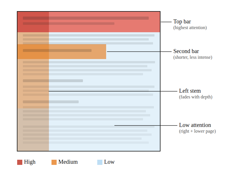
The Nielsen Norman Group first published findings on how people read web content in 2006, based on a study tracking the eye movements of 232 participants across thousands of web pages (Nielsen, 2006). The headline finding was: in the absence of good visual design, people read in a shape that roughly resembles the letter F. They read across the top of the content, move down and read across a shorter second line, and then scan vertically down the left side of the page, with decreasing attention as they go further down.
A follow-up study eleven years later found the same patterns holding across both desktop and mobile devices (Pernice, 2017). The F-pattern, it turns out, is not a product of early web design habits that people would grow out of; it reflects something more fundamental about how people navigate unfamiliar text when they have limited time and motivation to read everything.
The F-pattern is that it is not desirable behaviour. It is what happens when design gives people no better option. When a screen presents a wall of text with no clear hierarchy, no meaningful headings, and no visual signals about where the important content sits, people default to the F-pattern because it is the path of least effort. They read what is early, they read what is left-aligned, and they skip the rest.
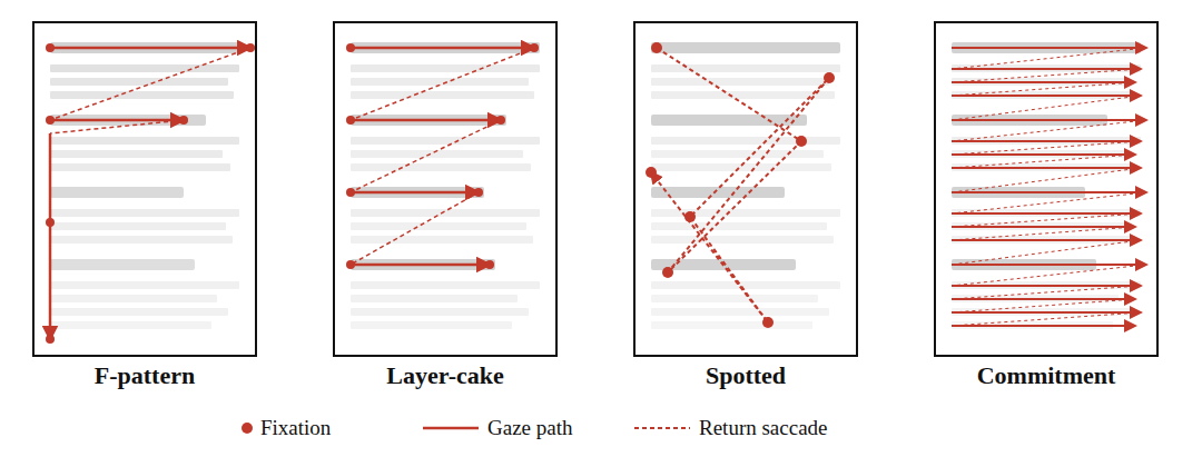
The 2019 NN/g research expanded the picture considerably by identifying three other scanning patterns that appear alongside the F-pattern depending on how content is structured and how motivated people are to engage with it (Pernice and Whitenton, 2019).
The layer-cake pattern occurs when meaningful headings and subheadings are present and visually distinct. People skip between headings, assess whether the section beneath is relevant to them, and read more carefully when they find something that matters. This is the most efficient scanning pattern for information-seeking tasks, and it is achievable through good heading design.
The spotted pattern occurs when someone is looking for something specific, such as a number, a link, or a keyword. They skip large sections of content entirely in search of the target. This pattern tends to reveal poor content architecture: if people are spotted-scanning an e-learning module, it is usually because the thing they need is buried rather than surfaced.
The commitment pattern is the closest thing to the linear reading most e-learning designs assume. It occurs when someone is highly motivated to read carefully, either because the content is directly relevant to something they care about, or because they know they will be assessed on it. Importantly, even the commitment pattern benefits significantly from good content structure; chunked, well-headed content produces better comprehension than walls of text even when people are genuinely trying to read everything (Pernice and Whitenton, 2019).
What This Means for How We Design Screens
Content placement is not neutral
The top of the screen receives the most attention; the left side retains more attention than the right as the eye moves down the page. Content placed in the lower-right area of a screen is, in the absence of strong visual signals directing attention there, largely invisible to most people. This matters enormously for where we place key information, critical instructions, and anything that people must understand before they proceed.
The first words of every line carry disproportionate weight
In the F-pattern, people fixate on the beginning of lines and then make a rapid decision about whether to continue across or drop to the next. If the first few words of a paragraph do not signal relevance, the paragraph will be skipped. This argues strongly for front-loading: the most important word or phrase in any sentence should appear as early in that sentence as possible, and the most important sentence in any paragraph should appear first.
Headings do more work than most e-learning designers give them credit for
In the layer-cake pattern, headings are the navigation system. People use them to decide what to read and what to skip. A heading like “Section 3” or “Key Points” tells someone nothing about whether the content below matters to them; a heading like “What to Do When a Customer Escalates a Complaint” tells them immediately. Meaningful, specific headings are the single highest-leverage design change available for improving how people move through digital content.
Walls of text are not read
This sounds obvious, but the evidence is that they are not even scanned efficiently; they produce the F-pattern, which means that anything more than a few lines into a block of unbroken text will receive little or no attention. Chunking content into shorter paragraphs, separating sections with visual whitespace, and using formatting to signal structure are all practical responses to the way people actually scan.
The right side of the screen is largely unused for text content
This does not mean the right side of the screen is useless; images, diagrams, and visual elements placed there can attract and hold attention effectively. But columns of text on the right side of a two-column layout will typically receive far less attention than the equivalent content on the left.

If you want to up your learning science game, join us on the 29th of May 2026 in Birmingham for IDTX Evidence-Informed practice Conference where research meets practice.
As a reader of the Instructional Design Tips Substack, you can get 25% off your ticket using code CPDW25 at checkout.
Learning Objectives
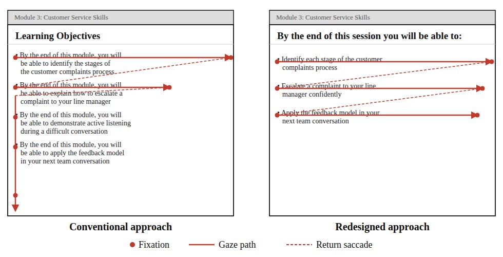
A great deal of existing e-learning begins with a list of learning objectives on the first or second screen. This has been common practice for decades, grounded in the reasonable idea that people should know what they are going to cover before they cover it. The problem is that, in practice, these screens are almost universally formatted in ways that guarantee they will be scanned in the F-pattern and largely ignored.
A bulleted list of objectives that begins “By the end of this module, you will be able to...” presents the least important words first in every line, places the most specific content towards the end of each bullet, and provides no visual hierarchy to signal which objectives matter most. People read the first bullet partially, skim the beginning of the next two or three, and click next.
If objectives screens are going to be included, the research on scanning behaviour suggests they should be written with the most meaningful, specific words at the start of each objective, kept to three at most, and given enough visual separation that each one reads as a distinct item rather than a list that blurs together. If there are more than three objectives, the question worth asking is whether the module scope is too broad, not how to format a longer list.
Note: The above does not represent well-designed learning objective screens, only how people are likely to interact with the text. I do not recommend starting digital learning with a list of learning objectives, but since this practice is still common across much of the industry, if you do use one, this should be taken into account.
Designing for the Commitment Pattern
The commitment pattern, in which someone reads carefully and thoroughly, is achievable in digital training contexts, but it requires two things that are often absent: content the person believes is directly relevant to something they care about, and design that does not punish careful reading.
On the first of these, eye-tracking research is clear that motivation is the primary driver of the commitment pattern (Nielsen, 2006; Pernice and Whitenton, 2019). People read carefully when they believe the content will help them do something they want or need to do. So, if the programme is not perceived as relevant to real work, no amount of good layout will produce careful reading.
On the second, the research shows that even committed readers, those in the commitment pattern, comprehend more when content is structured with clear headings, shorter paragraphs, and deliberate whitespace. Good design does not interrupt careful reading; it supports it. The argument sometimes made that formatting and chunking are only necessary for low-engagement content is not supported by the evidence.
A useful exercise is to take any screen you have built and ask two questions:
where would someone’s eye go first if they arrived at this screen with moderate motivation?
would the content that receives the most early attention be the content that matters most?
If the answer to the second question is no, the screen needs redesigning before it needs editing.
A Practical Review Process
Incorporating scanning behaviour into design review does not require eye-tracking equipment or specialist software, though both are available and informative if you have access to them. A structured walk-through of any material using the following questions gives a reasonable approximation of what the research predicts.
Cover the lower-right quadrant of the screen and assess how much of the critical content remains visible. If the answer is very little, the layout needs reviewing.
Read only the headings, ignoring all body text, and ask whether someone who read only those headings would have a clear sense of what the screen covers and why it matters. If they would not, the headings need rewriting.
Ask whether a motivated person who wanted to read carefully would be helped or hindered by the current structure. If the structure imposes cognitive work on someone who is trying to engage, it is working against the content.
These questions do not replace user testing, which remains the most reliable way to understand how people engage with a given piece of content, but they make scanning-behaviour research actionable in everyday design practice without requiring significant additional time or resource.
Designing for how people actually read is a straightforward act of respect: if we understand that people scan before they read, and that scanning behaviour is shaped almost entirely by the design decisions we make, then building screens that ignore those patterns is a choice to prioritise our convenience over their experience, and the evidence suggests performance suffers accordingly.
References
Nielsen, J. (2006) ‘F-shaped pattern for reading web content’, Nielsen Norman Group.
Nielsen Norman Group (2022) ‘The layer-cake pattern of scanning content on the web’.